Boring products don't need to look exciting on video. They need a creator format that names the buyer's biggest doubt in the first second, then resolves it in a way the viewer can see.
I learned this doing deep research into what makes short-form video work for niche physical products. Marketing teams in categories like picture frames, diet bread, and bean pasta kept giving me the same excuse: our product is too boring for social video. Nobody watches videos about picture frames.
That framing is wrong. The product isn't boring. The brief is.
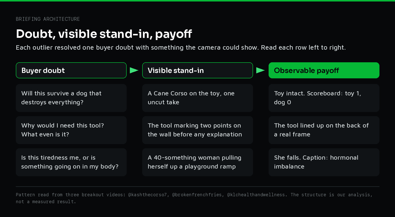
Every category I dug into had the same structural issue. Brands handed creators a feature list and expected polished lifestyle content that made the product look beautiful. But the outlier videos driving performance in these spaces weren't the beautiful ones. They named the objection in the first second and then resolved it on camera.
So if you want to create engaging product videos for boring or niche products, stop trying to make them aesthetic. Make them credible.
The problem with the lifestyle brief
If you run a niche business, you know the friction point. A buyer looks at your custom picture frame and can't tell why it costs more than the one at the big box store. A shopper looks at your keto bread and assumes it tastes like cardboard.
Hand that product to a creator with a lifestyle brief and the creator ignores the friction. They smile, hold the product up to the camera, and say how much they love it. The viewer scrolls past. Nobody cares if a stranger loves a picture frame. They care whether the frame will look cheap on their wall.
Winning content resolves the doubt instead of ignoring it. Across my outlier scan, breakout videos in these categories weren't driven by polished aspiration. They were driven by surprisingly credible delivery, where a creator settles a specific fear on camera. If you'd rather have a team find those doubts and turn them into briefs for your category, see how our Creative Systems and social media marketing teams run that process.
| Creator Format | Best Product Fit | First 3 Seconds (The Setup) | Visual Payoff (The Resolution) |
|---|---|---|---|
| :--- | :--- | :--- | :--- |
| The Wrong Aisle Test | Unfamiliar or misjudged items (dog chews, natural food dyes, custom hardware) | Show the unlabeled object or finished result with packaging hidden from frame. | Reveal the packaging or identity after 12 to 15 seconds once curiosity is locked. |
| The Skeptic-Reversal Diary | Sensory or functional skepticism (low-carb bread, bean pasta, sleep gear) | Creator voices the exact category complaint while starting a physical stress test. | Uncut physical test (like squeezing a loaf slice) disproves the complaint on camera. |
| The Objection as Hook | Premium upgrades over commodity items (gourmet cookies, custom picture frames) | Pin the price or quality objection as the first text overlay before showing the brand. | Side-by-side macro comparison or interior cross-section justifies the price gap. |
| Component-First Assembly | Mechanical or craft-heavy goods ("The Fourth Corner" picture frame moulding) | Four loose parts on a workbench with a three-word hook ("Four sticks. One frame."). | Tightening the final joint into a dead-square finished piece in one continuous shot. |
Next step
Get creator videos built around the doubt your buyer already has.
See how we build creative systems for niche brandsMechanism 1: The Wrong Aisle Test
This format uses a withheld-identity cold open. You show the product or its result without naming it, and you make the viewer guess. It works best when the product looks or performs differently from what buyers expect.
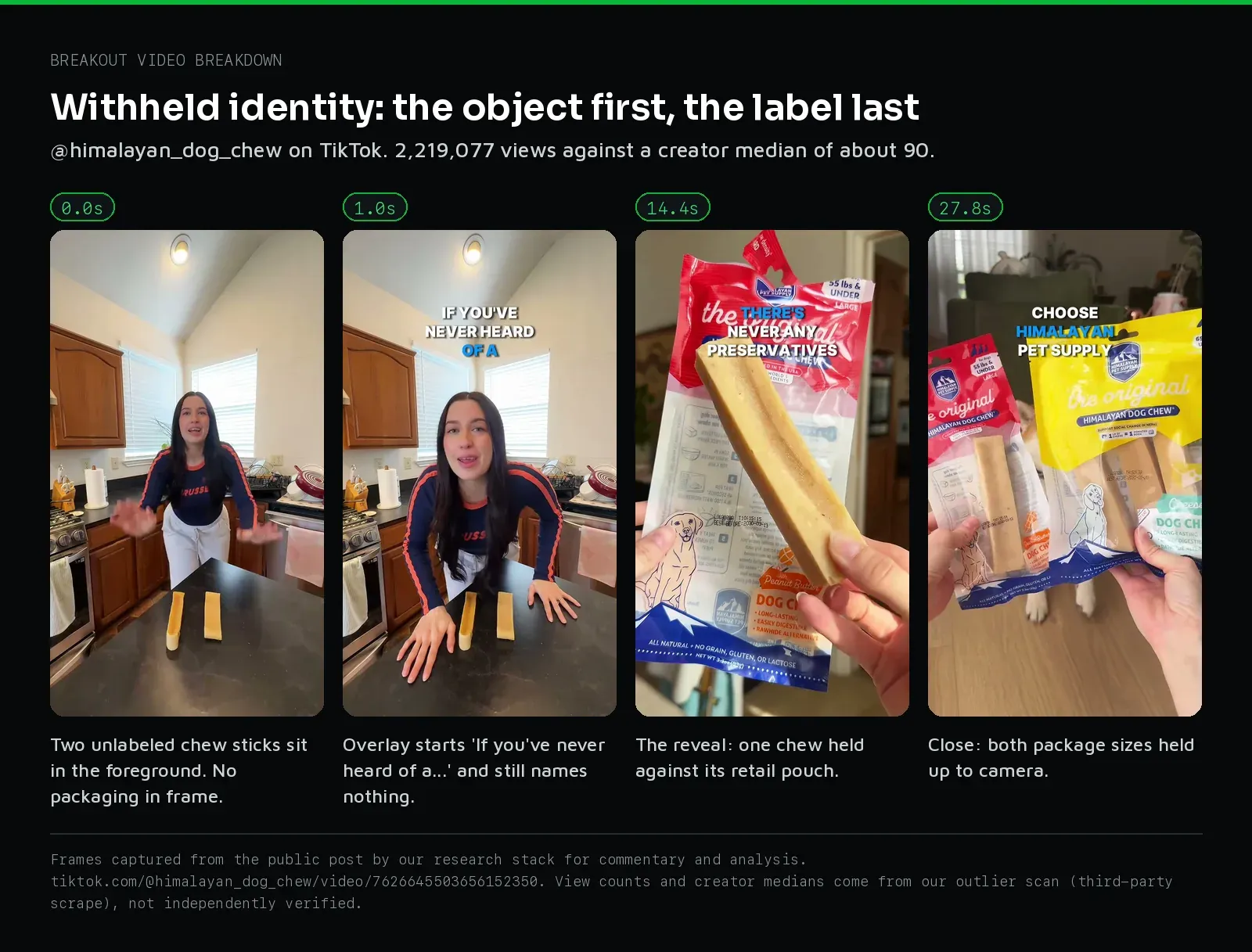
When people buy on the label, they bring all their baggage about your category. Take the label away, and they guess wrong.
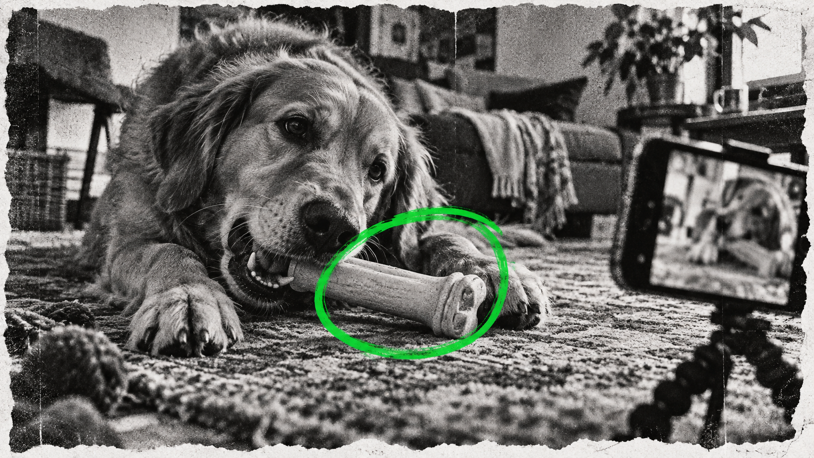
I saw the real version of this in a dog chew video from @himalayan_dog_chew. Two unlabeled chew sticks sit on a kitchen counter with no packaging in sight. The overlay reads "If you've never heard of a..." then "Let me tell you in under 30 seconds." The packaging isn't shown until about 14 seconds in. That video pulled 2.2 million views against a creator median of roughly 90. The identity withhold is doing the work, not the product shot.
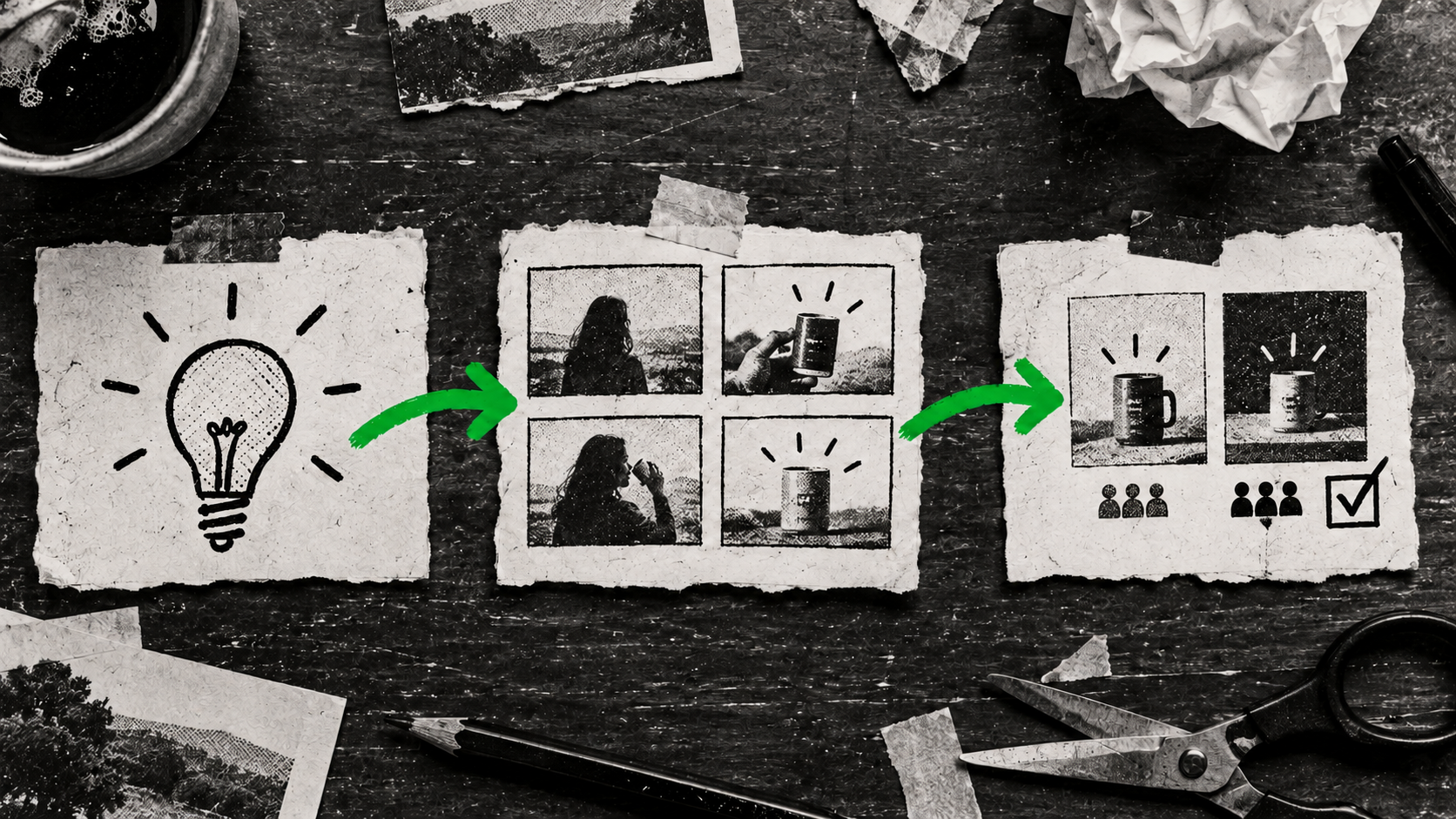
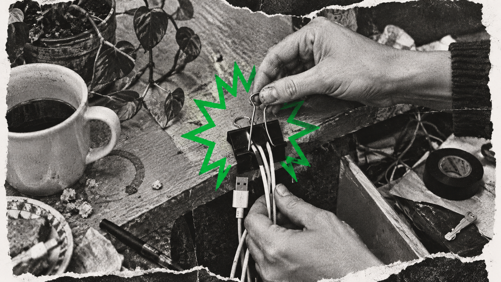
For a custom picture frame company, the version I'd brief is called "The Fourth Corner." It's a component-first macro assembly. The creator shows four loose moulding sticks being joined on a workbench. The hook is simple: "Four sticks. One frame." The brand reveal is held back, so the viewer watches to see the pieces become one object under a tightening joint. This is an untested idea, built on the same logic as the chew video: a mechanical assembly holds attention better than a static aesthetic shot.
I'd try a similar idea with a natural food dye brand. Buyers expect natural food dye to look muted or pale. The idea is to show the vibrantly colored baked good first without mentioning it's natural. Let the viewer assume it's full of artificial dye, then reveal the truth. This withheld reveal is a hypothesis, not something I've tested, but it should hold attention because it forces a reset of expectations.
Mechanism 2: The Skeptic-Reversal Diary
The creator names the objection openly in the first frame, then logs their experience to resolve it. It fits buyers who are already skeptical of the whole category.
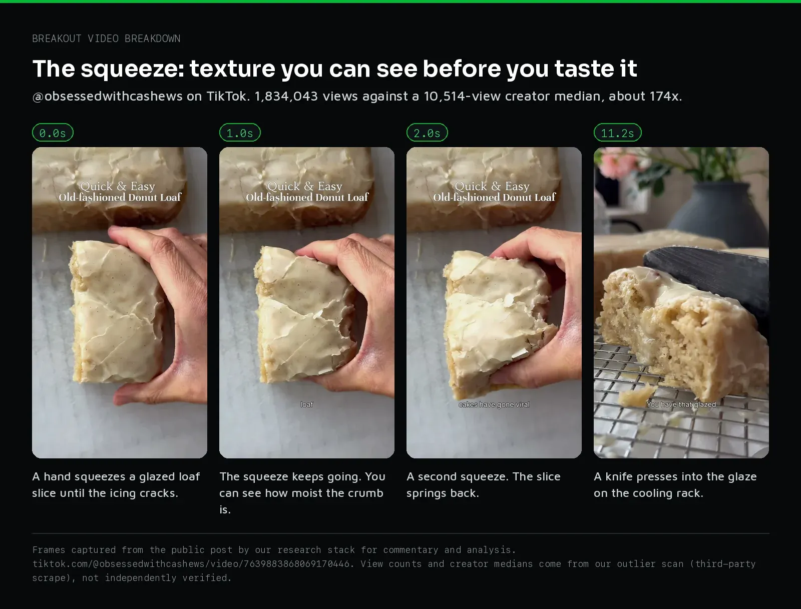
Take a keto and low-carb baked goods brand. The primary fear is that diet bread tastes dry. The real version of this pattern comes from @obsessedwithcashews: a hand squeezes a thick slice of a glazed loaf until the icing cracks and the crumb shows, squeezes again, then a knife goes into the glaze. That video pulled 1.8 million views, about 174x the creator's median. The hook isn't about how great it tastes. It's a physical test of the texture, and it disarms the crumbly-gluten-free objection before the creator takes a bite. I break down why a moment like that squeeze outperforms a spoken benefit in why visible proof beats a polished product explanation.
For a bean pasta brand or any team running social media marketing for food and CPG brands, the version I'd brief follows the same logic. Buyers expect diet-friendly pasta to have compromised texture. The creator starts the video by saying exactly that: "I didn't think diet pasta could taste like the real thing." Then they show the physical proof. The format works because the creator sides with the buyer's doubt immediately.
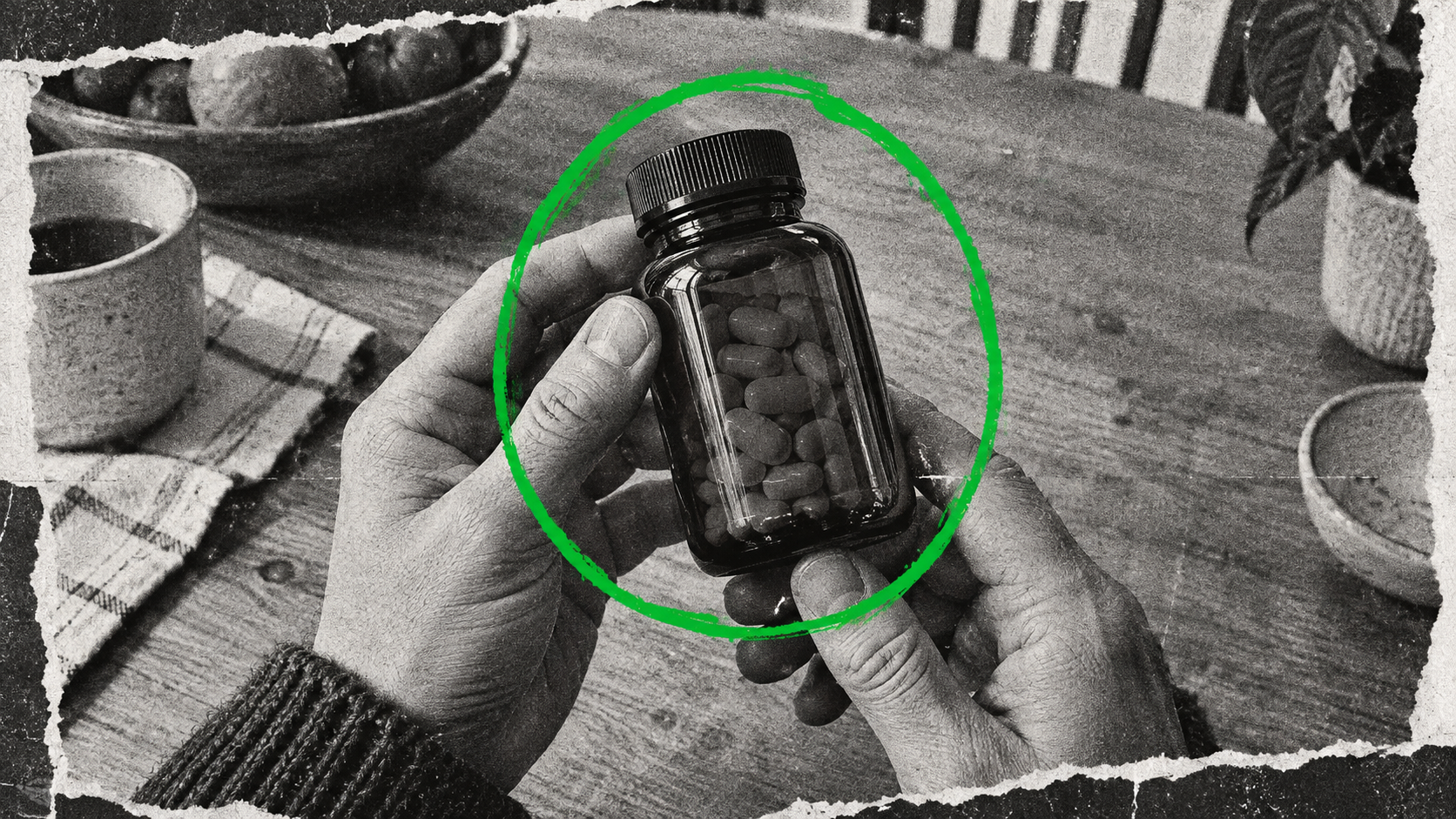
For a neuroscience wellness brand, where the claim is deep rest without a complicated ritual, the objection runs even higher. Buyers doubt a simple experience will produce a noticeable shift. The skeptic-reversal diary is an untested idea for this space. The creator has to start by saying they expect it to fail, then document the genuine shift.
Mechanism 3: The Objection as Hook
This is the most direct format. The primary buyer fear becomes the first on-screen text. It pulls in the buyers who need convincing, because it mirrors the thought that's keeping them from buying.
Take a gourmet gift cookie brand selling premium cookies. The primary objection is simple: "Is this actually better than grocery cookies, and is it worth the premium?" If the video starts with a creator saying "Look at these amazing cookies," the skeptical buyer leaves.
If the first on-screen text reads "Is this actually better than a grocery store cookie?" the dynamic changes. The objection in frame one, before the product even appears, earns the next ten seconds. The rest of the video answers that question with visual proof. This is the idea I'd pitch for premium, sensitive, or high-trust products where the buyer is looking for a reason to say no.
The adaptation boundary
These formats only work when the product genuinely resolves the objection.
If you use the Skeptic-Reversal Diary, the product has to perform. If a creator squeezes a dry gluten-free muffin on camera and it crumbles, the video confirms the fear. The format collapses when a creator has to pretend the resolution happened. You can't edit your way out of a product failure.
You can borrow the mechanism. You can use the Wrong Aisle Test or put your biggest objection in your opening hook. But the physical proof has to be original to your brand, and it has to be true.
A practical test you can run this week
Stop asking creators for lifestyle videos. Run a three-video test focused entirely on your biggest objection.
- Write down the number one reason people don't buy your product.
- Give that exact sentence to a creator.
- Ask them to make that sentence the first thing they say in the video.
- Ask them to spend the rest of the video trying to prove that sentence wrong using only their hands and the product.
Don't give them talking points. Don't give them a script about your brand history. Just give them the objection and the product.
What makes this test fail
This test fails if you step in and soften the hook.
Founders hate hearing their product called expensive, boring, or weird. When the creator sends a draft that starts with "I thought this natural dye would look terrible," your instinct will be to change it. You'll want them to say "I was so excited to try this natural dye."
If you change the hook, you break the mechanism. The tension is what holds the viewer. Without it, you've got another boring ad.
If your product is boring, lean into it. Name the friction and show the proof. When you're ready to put that on paper for a creator, here's how to brief a creator video so the feature lands immediately.