- Home
- About
- Services
-
-
- Marketing and Identity
- Content Marketing
- Brand Identity
- Marketing Analytics
- Online Reputation Management
-
- Communications
- Public Relations Firm
- Crisis Management
-
- Case Studies
- Insights
Call us now at (504) 233-3627 or fill out the form below to schedule a free consultation.
This article was inspired by my YouTube video “How to Build a Billion-Dollar Brand: Brand Messaging Secrets from Discord, Uber, and Netflix“. Watch the video or subscribe to my newsletter.
Transforming an idea into a billion-dollar enterprise is no small task. Companies like Discord, Uber, and Netflix demonstrate that reaching such heights involves much more than luck or perfect timing. These industry giants have mastered the art of combining innovative messaging, user-centric design, and a laser-focused approach to solving real-world problems. Starting as modest ventures, they not only grew exponentially but also redefined their respective industries and became indispensable in our daily lives.
The remarkable journeys of tech titans like Discord, Uber, and Netflix demonstrate the strategies that transformed them from startups into global household names. These companies have shown exceptional skill in branding and messaging, developing value propositions, captivating their target audiences, and continuously refining their user experiences to ensure sustained growth. Through strategic maneuvers and innovative approaches, they have redefined their industries and cemented their places as essential components of daily life around the world.
Entrepreneurs, marketing professionals, and business owners can derive valuable lessons from the success stories of Discord, Uber, and Netflix. The important decisions and tactics that fueled their extraordinary successes provide practical strategies that others can apply to their own brands. By understanding and implementing these approaches, aspiring business leaders may position themselves to become the next big phenomenon in their industry.
When Discord launched in 2015, its mission was clear: to revolutionize how gamers communicate. Co-founders Jason Citron and Stan Vishnevskiy were driven by their own frustrations with the clunky and unreliable communication tools available to gamers. Their vision was to create a superior alternative, and their timing couldn’t have been better. The gaming community was eagerly awaiting a platform that could seamlessly integrate voice, video, and text chat.
Upon its launch, Discord presented a compelling invitation: “It’s time to ditch Skype and TeamSpeak.” The value proposition was clear and potent: “All-in-one voice and text chat for gamers that’s free, secure, and works on both your desktop and phone.” This message effectively highlighted the core benefits of Discord’s platform: it was free, offered high-quality communication, was customizable, and functioned across multiple devices.
The design of Discord’s initial launch site was carefully crafted with gamers in mind. The hero section of the website was particularly impactful, with a headline that captured attention by clearly stating the core value proposition. The call-to-action was prominent and uncluttered, urging users to start using the platform immediately. The overall design had a sleek, game-centric aesthetic, featuring a left-justified main message and a call-to-action button, made for a Western audience. The right column of the site highlighted the app’s compatibility with various platforms and offered a glimpse of its user-friendly interface.
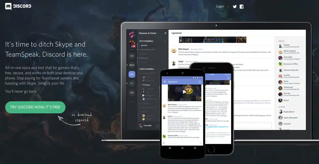
Discord’s website effectively demonstrated its unique features and benefits. It included a feature comparison table that clearly demonstrated Discord’s advantages over competitors like Skype and TeamSpeak. The site also reassured users that the core features would always remain free, addressing a major concern for gamers who were tired of paying for voice chat. Additionally, it emphasized the platform’s minimal impact on system resources, which is a crucial consideration for gamers, and simplified server management for community creators, making it easy to set up and maintain servers.
By 2021, Discord had significantly evolved and expanded its user base beyond gamers to encompass various online communities, from study groups to art collectives. The updated tagline, “Your place to talk,” reflected Discord’s broader appeal, indicating its transformation into a versatile communication tool for anyone looking to stay connected.
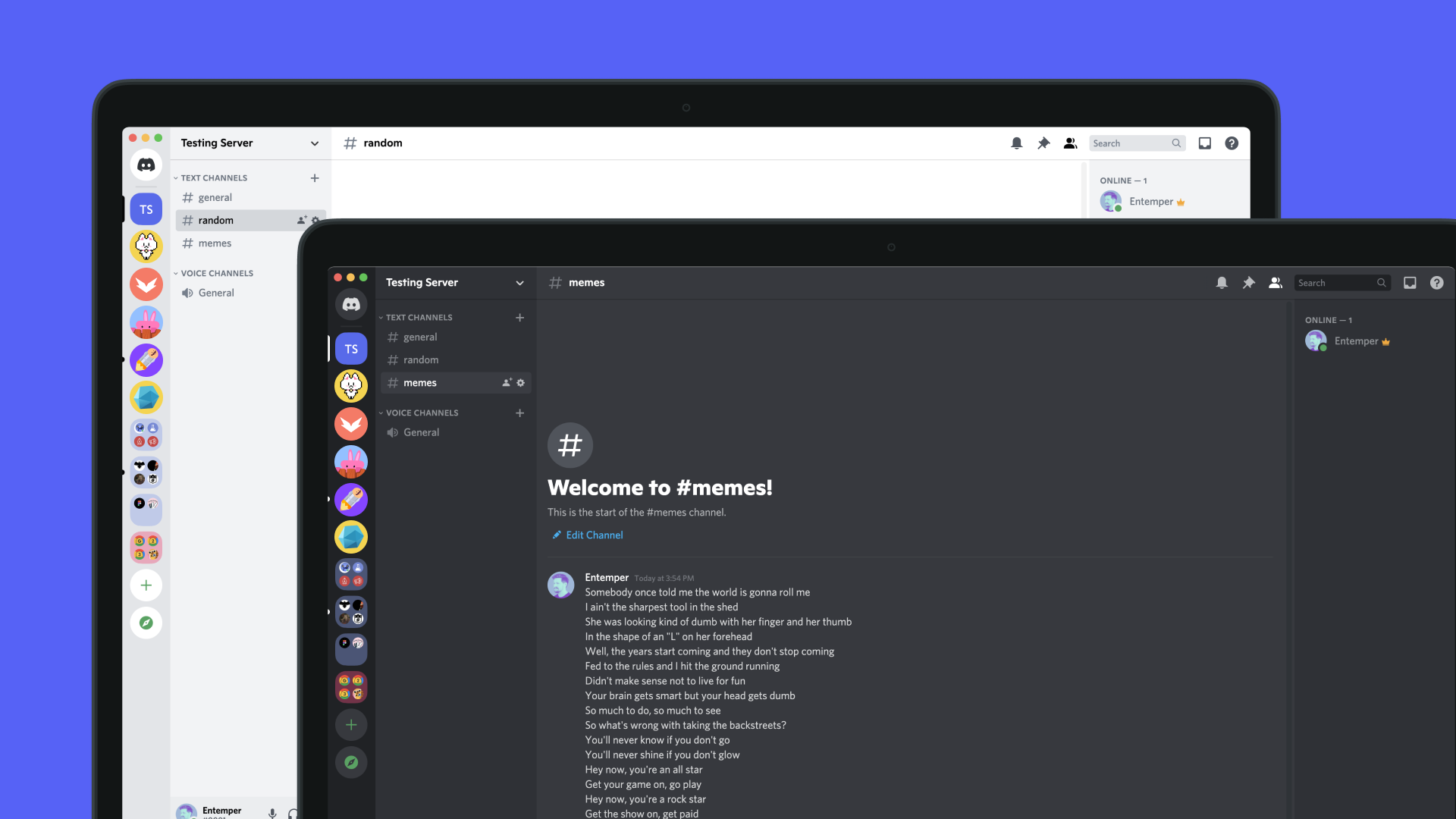
The 2021 version of Discord’s website featured a bright, inviting design that felt inclusive and welcoming. The new tagline and subheading positioned Discord as a platform suitable for a wide range of use cases, from school clubs to art communities. The site continued to emphasize ease of use, reliability, and scalability as key value propositions, attracting an even broader audience and further cementing Discord’s position as a leader in online communication platforms.
Discord’s website featured several strategic sections aimed at enhancing user engagement and expanding its reach:
Discord’s development journey offers several valuable lessons for businesses aiming to scale and adapt in dynamic markets:
By focusing on the specific needs of its users and continuously evolving its platform and messaging, Discord has successfully transitioned from a gaming-centric communication tool to a versatile platform that serves various groups. This transformation underscores the effectiveness of clear value propositions, user-centric design, and relentless optimization in achieving sustained growth and relevance.
In the late 2000s, a revolutionary concept took shape: the creation of a seamless, technology-driven transportation network. This idea came to life with the founding of Uber in 2009 by Garrett Camp and Travis Kalanick. Uber’s initial mission was audacious yet straightforward: to make the luxury of hiring a personal driver as simple as pressing a button on your smartphone.
By 2010, Uber’s website reflected its mission to transform the high-end, on-demand car service industry. The tagline “Everyone’s Private Driver” effectively communicated their value proposition, which aimed to democratize what had traditionally been considered a luxury service.
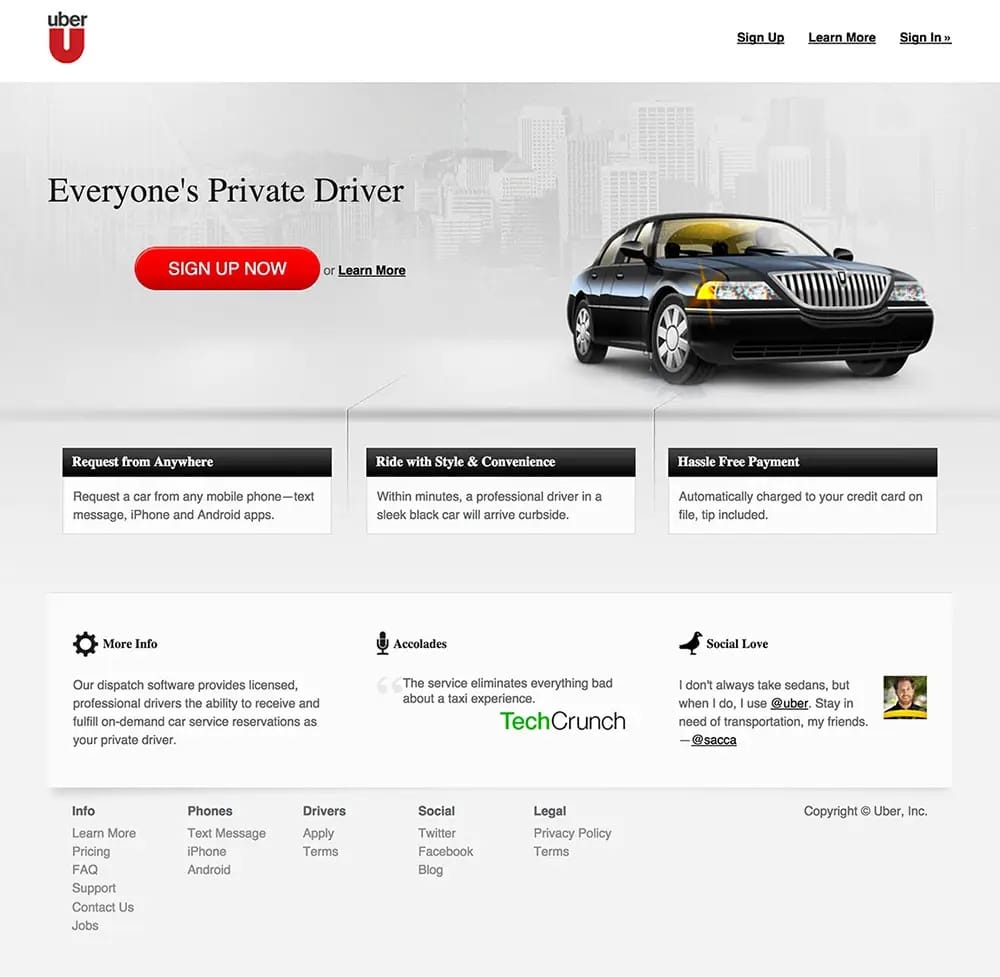
Uber’s early value proposition centered on convenience, cashless transactions, and rapid service. Their messaging highlighted several of the following key features:
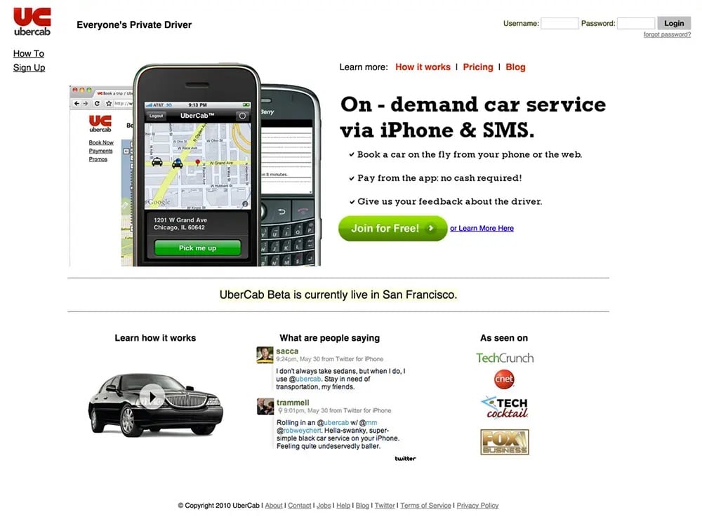
By 2013, Uber had significantly refined its user experience and brand positioning. The website from this year featured a more luxurious and sophisticated design that reflected Uber’s growth and evolving brand identity.This version of the website boasted a luxurious, moody aesthetic with a prominent “SIGN UP NOW” CTA. The following key sections of the website focused on enhancing the core Uber experience:
Uber enhanced its credibility by incorporating more social proof, featuring accolades from prominent platforms like TechCrunch and endorsements from well-known influencers, including @sacca. The website also included a comprehensive footer with legal information, driver resources, and contact details, showcasing the company’s commitment to transparency.
Uber’s platform demonstrated significant strengths, notably in its clear and concise content. The messaging was straightforward, adeptly focusing on the core benefits and effectively communicating the essence of its service. This clarity was complemented by a polished, premium design that perfectly aligned with Uber’s luxury brand image, reinforcing its positioning in the market as a high-end service provider.
However, there are areas where Uber’s website could see improvement. The visibility of the “SIGN UP NOW” button could be enhanced to better capture user attention, making it a more compelling call to action. Additionally, incorporating a more diverse range of user testimonials could broaden the service’s appeal, making it resonate with a wider array of user demographics. By addressing these aspects, Uber could further refine its user engagement and broaden its market reach.
Uber’s evolution offers several critical insights that can guide other businesses in their journey toward success. A primary lesson is the importance of prioritizing user experience; focusing on intuitive design and clear calls-to-action is essential. This approach ensures that users can navigate the platform effortlessly, which enhances their overall interaction with the service.
Another key takeaway is the need to clearly highlight unique advantages. Articulating what sets your service apart from competitors can significantly impact market presence and customer choice. Additionally, it’s vital to evolve with your market. Regularly updating your website to reflect changes in your business and the needs of your audience helps maintain relevance and responsiveness in a dynamic marketplace. By adhering to these principles, businesses can build an adaptive online presence.
Each iteration of their website demonstrated a deeper understanding of user needs and a commitment to enhancing the user experience. Their design philosophy guided visitors towards specific objectives with intuitive navigation, clear information, and persuasive calls-to-action. The focus was always on providing a seamless and enjoyable user experience.They effectively used social proof to reinforce its authority and trustworthiness. Incorporating customer reviews, case studies, and media mentions played a crucial role in building trust with potential users.Uber’s messaging focused on how their services could improve users’ lives, ensuring that the benefits were relatable and impactful, rather than just listing features.
Their transformation from a scrappy startup to a global leader in ride-hailing underscores the importance of innovative thinking, clear messaging, and user-centric design. For founders and marketers, the key takeaways include:
By adopting Uber’s strategies businesses can craft an engaging online presence that resonates with their audience and drives success, demonstrating that with the right approaches, it is possible to revolutionize an industry and establish a lasting brand.
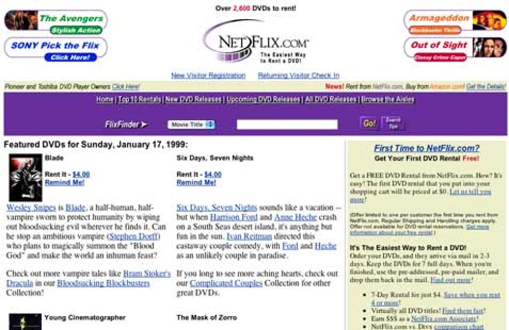
In 1999, Netflix was a fledgling startup with an ambitious dream: to transform the way we rent movies. Dominated by Blockbuster, the market saw Netflix introduce an online DVD rental service that promised no late fees and convenient home delivery, radically differentiating itself from traditional video rental stores. Netflix’s early website was straightforward: “No Late Fees, No Due Dates, Unlimited Rentals.” This clear messaging tackled the frustrations of video rental customers head-on, offering a more convenient and user-friendly solution.
The 1999 website embodied the era’s design ethos—simple and text-heavy with blue hyperlinks. It focused on this essential information:
Despite laying a solid foundation, the 1999 site had several areas ripe for enhancement. A clearer visual hierarchy could better guide users’ eyes from new releases to personalized recommendations, improving navigation and user experience. Enhancing interactivity by incorporating features such as trailers or a queue system would make browsing more engaging and dynamic. Additionally, a stronger call-to-action, crafted to be more bold and compelling, could effectively nudge users toward signing up, increasing user engagement and conversion rates.
By 2004, Netflix had significantly refined its website to better communicate its value proposition and engage users. The design became cleaner and more user-centric, emphasizing the core benefits of the service.The tagline “DVD rentals delivered to you!” succinctly captured Netflix’s essence. The message of affordability was also clear, with plans “Starting at only $11.99 a month,” targeting budget-conscious consumers. The site utilized a cozy image of a couple enjoying a movie night at home, creating an emotional connection with visitors. This imagery made it easy for users to imagine the benefits of Netflix’s service in their own lives.In addition, A prominent “Start Your FREE TRIAL” CTA was featured, inviting users to try the service without any risk. This approach effectively lowered the barrier to entry and was instrumental in attracting new subscribers.
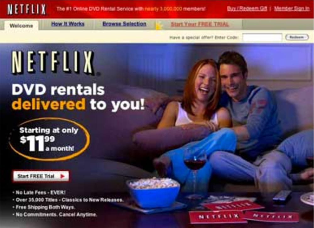
Netflix’s key benefits were strategically and clearly outlined, directly addressing the specific desires and concerns of movie enthusiasts. They addressed several significant consumer frustrations with its innovative features, drastically improving the rental experience. The elimination of late fees removed the penalties traditionally associated with rentals, relieving a common pain point for many. Additionally, with an extensive library of over 35,000 titles, Netflix catered to a diverse range of tastes, ensuring there was something for everyone. The convenience was further enhanced by offering free shipping both ways, which not only made the process easier but also more cost-effective. Moreover, the flexibility to cancel at any time without commitment reduced user anxiety about being locked into long-term agreements, making Netflix an appealing choice for those wary of commitments.
The website prominently displayed “Nearly 3,000,000 members,” leveraging this social proof as a potent tool to build credibility and trust among potential subscribers. By 2014, recognizing the shifting dynamics of digital entertainment, Netflix pivoted from its DVD rental model to focus primarily on streaming. This transition marked a significant evolution in its business strategy. The updated value proposition centered on providing instant access to a vast library of movies and TV shows, perfectly capturing the essence of convenience and accessibility with the promise: “Watch TV shows and movies anytime, anywhere.”
The 2014 iteration of Netflix’s website showcased a modern, streamlined design that prioritized user experience. By utilizing sophisticated algorithms, the platform was able to offer personalized content recommendations that were made for individual user preferences, greatly enhancing content relevancy. Additionally, the introduction of multiple profiles allowed different family members to create their own personalized viewing experiences, thereby boosting user engagement across various demographics within a household. Another significant feature was offline viewing, which enabled users to download content and enjoy their favorite shows and movies without the necessity of an internet connection, adding a layer of convenience and flexibility to their viewing habits. The “Join Free for a Month” CTA was strategically placed to attract new users, providing a risk-free trial period that encouraged users to experience the benefits of the streaming service firsthand.
Netflix’s journey offers several vital lessons for businesses looking to impact their industries significantly. One of the key takeaways is the importance of innovation to disrupt the market. Netflix has shown that striving to redefine industries and create new market opportunities can lead to substantial growth and leadership. Additionally, simplifying the design of digital platforms to enhance the visibility of content and calls-to-action is crucial for maintaining user engagement and ensuring ease of use. Another important strategy is leveraging social proof, such as user testimonials and showcasing community size, which helps build trust and validate the platform’s credibility. Lastly, the need to adapt and evolve is critical; continuously updating the platform to meet changing user needs and market trends ensures that a business remains relevant and competitive in a dynamic environment.
Netflix’s transformation from a humble DVD rental service to a global leader in streaming exemplifies its capacity for adaptation and innovation. Over the years, the company has continuously evolved its platform and refined its messaging to stay ahead of the competition and align with changing user expectations. A constant focus on user experience has been central to Netflix’s strategy. The platform’s design and functionality have been systematically enhanced to boost user satisfaction, ensuring that subscribers have a seamless and enjoyable viewing experience.
By leveraging personalized recommendations and integrating features like multiple profiles and offline viewing, Netflix has set a high benchmark for user-centric design within the entertainment industry. These features not only cater to individual preferences but also enhance the overall convenience of using the platform.
Netflix’s evolution provides profound insights into the development of a resilient and successful brand, offering strategic lessons for businesses aiming to achieve similar success, such as:
Embracing these principles can empower businesses to create compelling, user-centric platforms that withstand the test of time. Netflix’s story demonstrates that with consistent innovation, clear communication, and a dedicated focus on user experience, it is possible to transform an industry and establish a brand renowned for its excellence and reliability.
The remarkable journeys of Discord, Uber, and Netflix offer invaluable insights for brands and entrepreneurs looking to build successful ventures. These tech giants demonstrate the power of understanding and addressing the real pain points of target audiences. For instance, Discord recognized the need for reliable gamer communication, Uber transformed the inconvenience of traditional taxis, and Netflix revolutionized DVD rental and streaming services. Each solution was tailored to specific user needs, highlighting the importance of deep market understanding.
A clear and compelling value proposition is critical. Each company communicated their unique offerings succinctly: Discord as an all-in-one voice and text chat for gamers, Uber as everyone’s private driver, and Netflix allowing access to TV shows and movies anytime, anywhere. These examples show how effectively framing the benefits can resonate with the targeted demographic. Continual optimization of the user experience based on feedback is another lesson these companies underscore. Regular updates and iterative improvements based on user interactions help keep the platforms aligned with evolving expectations, ensuring they remain intuitive and user-friendly.
Visual content plays a crucial role in demonstrating the product’s features and benefits. Engaging images, videos, and infographics can convey complex information quickly and effectively, helping potential users understand practical applications and benefits in real-life scenarios. Building trust and credibility through social proof is essential. Leveraging testimonials, user reviews, and media mentions, as done by Uber and Netflix, helps reassure potential customers of the product’s value and reliability. Transparency and openness about practices and policies also contribute to building a trustworthy brand image.Creating a welcoming and inclusive atmosphere is vital in today’s global market. Using inclusive language and imagery makes products accessible and appealing to a diverse audience. Promoting community among users can also enhance engagement and loyalty, creating a sense of belonging and active participation.
As businesses grow and markets evolve, adapting messaging is crucial. Companies must continually revise their value propositions and marketing strategies to stay relevant. Discord’s shift from a gamer-centric platform to a versatile communication tool illustrates the importance of evolving messaging to meet broader needs.Innovation should aim to disrupt and redefine industries, not just improve existing solutions. For example, Netflix’s transition from DVD rentals to streaming changed media consumption globally. Thinking big and embracing change can lead to significant market impacts.
Lastly, utilizing data-driven insights for decision-making is indispensable. Analytics can reveal user behavior patterns, preferences, and trends, guiding more informed strategies that enhance the product and overall user experience.By integrating these strategies, businesses can effectively meet customer needs and build enduring brands that remain competitive and relevant in rapidly changing markets.The journeys of Discord, Uber, and Netflix highlight the importance of innovative thinking, clear messaging, user-centric design, and continuous optimization. By understanding and applying these key lessons, you can build a brand that not only meets but exceeds user expectations, stands out in a crowded market, and achieves lasting success.
Schedule a free consulation with our marketing experts.
Would you benefit from millions of consumer touchpoints every month?
Could you handle a steady stream of new clients or customers?
Do you want marketing execution that meets your business goals?