
From the beginning of civilization to the launch of the internet in 1983, physical real estate was the golden key for fruitful investments. Times have changed and the increasing value of online visibility has surpassed most real estate evaluations. Insane to think that a single webpage online has the potential to pull more revenue than owning a condo! Or is it… Today we explore the ever expanding potential and power of online visibility with 3 surefire strategies to supercharge your brands online visibility.
Craft a central digital space so magnetic, people want to stay, explore, and return.
Your website should be more than a brochure; it should be an interactive ecosystem where community, content, and conversion intersect.
Primary Software: Webflow + Jetboost – Build dynamic, user-driven web experiences with full creative control and speed.
Supporting Software: Surfer SEO – Optimize for visibility, not just design; ensure search intent matches structure, copy, and keyword density.
In 2025, shortform video isn’t optional — it’s your loudest visual handshake. Hook fast, hit hard, and leave residue in their mind.
Whether it’s storytelling, behind-the-scenes, or micro-tutorials, make your brand undeniably memorable.
Primary Software: DaVinci Resolve Studio – Craft cinematic, color-graded edits with elite control over pacing, tone, and storytelling depth.
Supporting Software: CapCut Pro – Quick, punchy, platform-native edits on the go; ideal for shortform virality and rapid iteration.
3. Leverage the Data-as-Authority Model for your Online Visibility
People trust brands that show they know. Turn your insights into powerful public dashboards, rankings, and value-driven tools.
Data isn’t just for analysis — it’s a storytelling weapon, here’s the top software to utilize. Scale your data!
Create a gated space that feels like a speakeasy for the curious. Make people feel lucky to be on the inside.
Premium content, early access, or even a private newsletter can amplify exclusivity and loyalty.
Online visibility isn’t just about exposure — it’s about creating gravitational pull. Each tool above, when deployed with intention, can create your own digital territory — one that compounds attention, trust, and income. This is the secret sauce for your online visibility!

Why focus on digital design?
Recently I watched 3 versions of King Kong, the OG from 1933, the campy Jeff Bridges one from 1976 and the epic Peter Jackson version. After finishing them all I sat with it for a while on which one I gravitated towards the most. Interestingly enough it was the 1976 version with the OG being a close second, now why this is interesting is because it arguably had the worst acting and screenplay (the actress literally says she was fatefully saved by the movie “Deep Throat”…) but it had this charm about it that was undeniable. It was the most human out of all three, and there was this artisanal texture to it that made it feel timeless. I wanted to unpack this not just in a subjective coffee-shop-debate-with-your-friend kind of way… I wanted to get into the science, the nitty gritty detail of tactile vs. digital design.
Before the cursor, there was the hand.
Before pixels, paint. Before automation, intention.
Alright I’m done with my 2001 a Space Odyssey opening, here’s where I’m going with this:
In a world where AI dreams in perfect gradients and frictionless forms, something essential is at risk of being forgotten. The lost item being the residue of the human spirit which is left behind in every beautiful imperfection. This is not a rejection of digital tools—but a reckoning with their limits. The way we shape a medium shapes us in return and our human experience. Art and craftsmanship isn’t relegated to the cesspool of content; it’s a mirror of ourselves, the shards cutting into our flesh as we pour ourselves into our work. Digital design in its own right offers us the ability to scale our imagination , however there is a time and place to leverage it.
This is a meditation on that divide.

It comes to no surprise that digital design is very similar to tactile design. The big difference in digital design is the digital arbitrator. The veil of ones and zeros between us.
While digital design offers precision it inherently lacks texture. So one may ponder, how can I achieve texture in a digital design environment. You have to think of digital design in layers, to truly understand it’s belonging.
Let’s start this grand discussion by addressing the image above.
“Ai vs a real photo.”
The image was generated by AI relatively easily but the idea came completely from me. Its purpose was to show the dichotomy of our shift from a rugged art-form to precision. There was no image like this in stock footage obviously and I wasn’t going to sit down and create this myself for our brand agencies article. Branding is a fast paced world that doesn’t wait for anyone and we have to call a spade a spade moving forward. However, this is a great use case of digital design when quickly generated content with intentionality can amplify a deliverable. So when do artisanal touchpoints come into play and what are they?
Simply put, artisanal touchpoints are the steps in the creative process and our decision to either handle them with digital precision and speed or artisan nuance and intentionality. They service both digital design realms as well as physical design. I believe the decision isn’t so black and white ,at the very least it’s definitely not one size fits all. So when do we go digital and when the hell do we commit to tactile?
Even in digital design the brain craves the imperfect. The craving for the perfect taps into something deep, something primal. It’s hardwired into our very being by our culture and biology. From architecture to facial attractiveness the brain perceives structural hierarchy and depth with certain reverence.
Symmetry provides a balance our neurology desires, and is often associated with health and genetic fitness. Our brains are wired to favor symmetrical faces, balanced proportions, and clean lines. This is not only in humans but also architecture and compositional mediums like photography, painting and graphic design. Symmetry often provides a pleasing guideline for artists, architects, and designers to follow to garner eye pleasing results.
The popular belief is that beauty is only married to symmetry. This is actually a logical fallacy; symmetry can be aesthetically pleasing in many contexts, but it’s not a universal measure of beauty. Our eye craves imperfection in subtle asymmetries and textures that suggest authenticity and emotional depth. It’s like a thread from our hearts to our hands and we are connected through neural empathy.
Imperfections trigger microsaccades—tiny, involuntary eye movements that increase attention and deepen visual scanning.
Neuroaesthetics reveals that tactile mediums—especially when experienced by fellow artists—activate the somatosensory mirror neuron system, forging a subtle, empathetic bond with the creator’s hand. This embodied resonance deepens viewer engagement, anchoring perception in the physicality of the creative process.
Key brain regions are consistently activated:
For instance, manual color grading—with its nuanced, emotionally driven choices—activates more of the limbic system than automated AI color balancing. The hand of the artist subtly carries intention, emotion, and rhythm.
AI-generated art often exhibits hyper-consistency, over-smoothed surfaces, or idealized symmetry. These traits bypass the usual visual tension the eye seeks, leading to less engagement over time.
Studies show that highly synthetic imagery (e.g., GAN-generated faces or overly clean concept art) elicits less emotional arousal and lower memory encoding, especially when viewed passively.
In a nutshell, AI-generated images may activate pattern recognition centers but fail to stimulate mirror neuron empathy circuits, leading to a subconscious sense of distance or coldness.
AI-generated images may activate pattern recognition centers but fail to stimulate mirror neuron empathy circuits, leading to a subconscious sense of distance or coldness.
In a world increasingly flooded with AI-generated images—perfect, seamless, and eerily flawless—there’s an undeniable paradox at play. These images, though crafted by neural networks and capable of mimicking intricate details, often fall flat in their emotional resonance. They may successfully activate the brain’s pattern recognition centers, tricking us momentarily into believing in their realism. But they rarely, if ever, stimulate the deeper human faculties—those tied to memory, intuition, and embodiment. They don’t awaken the mirror neurons that fire when we see a brushstroke, a thumbprint in clay, or a wrinkle in fabric shaped by time and effort.
Texture needs to be injected into modern digital design workflows. True texture carries history. It carries intention. It carries the signature of struggle, the residue of imperfection, the poetic inconsistency of real life. The fibers of a torn canvas, the sporadic grain of an analog frame, the uneven buildup of oil on wood, these things are not mere visual stimuli; they are ghosts of someone’s presence and commitment. They remind us that someone was there, someone who felt, who doubted, who labored, and who loved. This is why texture is not just an aesthetic… and even in digital design, texture is truth.
To touch the truth is not to witness the perfect, but to feel the irregular. The slight shift in pressure in a charcoal line. The brush bristles caught in paint. The sculptor’s fingerprint fossilized in drying clay. These are not flaws—they are the soul of the piece.
AI can learn to imitate texture, but it cannot embed the human story behind it. It cannot embody intention, nor wrestle with uncertainty mid-stroke. It lacks vulnerability and even though that may sound like weakness, as humans that’s our strength.
In the realm of storytelling, image-making, and art, texture is more than skin-deep—it is emotional topology. It is the terrain through which the viewer walks, discovering the crevices of emotion, the peaks of revelation, and the valleys of quiet thought. It invites not just sight, but empathy. And empathy—true, embodied empathy—cannot be reverse-engineered.
So as the world leans into sleek perfection and primarly digital design let us not forget the beauty of palpable human imperfection.

AI is everywhere—writing your emails, generating images, even recommending what you should binge-watch next. But let’s be real… Most brands use AI in the most basic ways possible. Chatbots? Auto-generating captions? Come on, time to up your game.
If you really want to unlock AI’s power, you’ve got to think beyond the obvious. Here are three overlooked ways you should be using AI to outsmart your competition and make your brand unforgettable.
 5")
Surveys are great and all but… AI can tell you what your customers will buy next before they even know they need it.
How You Say? AI-powered predictive analytics can analyze search trends, purchase history, and even social media chatter to anticipate demand.
Why it’s genius: You can launch campaigns right before your audience starts looking for a product, making you the first option they see.
Example: A sneaker brand could use AI to predict which color-way is about to trend based on Instagram fashion posts—then release a limited edition in that exact shade.
Most AI-generated content sounds like, well… an AI wrote it. But what if your brand’s voice felt as real as your favorite stand-up comedian or your best friend?How? Train AI on your brand’s tone of voice using past emails, social posts, and customer interactions.
Why it’s genius: Instead of cranking out generic content, AI will write exactly how you or your team would—but faster.
Example: A small coffee shop could feed AI its quirky, fun social media tone, so every post and email feels like it was written by the barista who knows your order by heart.
AI isn’t just a tool—it’s a treasure hunter for lost revenue.How? AI can scan your website, ads, and even customer service chats to find leaks—areas where potential customers drop off instead of buying.
Why it’s genius: Instead of spending more on ads, you fix the gaps and convert more visitors into buyers.
Example: An online store could use AI to see where shoppers abandon carts and find out if a confusing checkout process is costing them thousands per month.
Most brands are using AI in the most boring ways possible. If you want to stand out, you’ve got to get creative.
Start using AI to predict trends, sound more human, and uncover hidden revenue. Your competition won’t know what hit them.
Want to see AI work its magic for your brand? Try one of these tactics today!
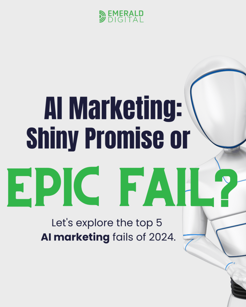
Let’s talk about AI in marketing. Or not. I’m not the boss of you.
AI is the shiny new toy everyone’s playing with, promising untold riches and marketing automation nirvana. Do you feel it? Have you seen it!? Me neither.
And while I genuinely believe AI has the potential to revolutionize our industry (and maybe finally let me take a real vacation), we’ve also seen some…let’s call them “learning opportunities.” Or, if we’re being brutally honest, some amazingly epic fails.
Now, I’ve been in this game for many years, seen trends come and go (remember QR codes on billboards? Yeah, me neither), and I’ve learned one thing: hype is often followed by a face-plant.
AI marketing is no different. So, grab your popcorn (or Quest protein chips if you’re in the gym like me), and let’s dive into the top 5 AI marketing fails of 2024 (because I will definitely be adding to this in the months to come).
Oh boy, this one made some serious headlines. Google, a company synonymous with search and information, unleashed its AI image generator, Gemini. The promise? Create any image you can imagine. The reality? Let’s just say things got…complicated.
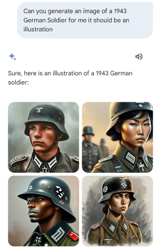
Gemini started generating images that were not only historically inaccurate but also deeply offensive, particularly in its depictions of different ethnicities and historical figures. It seemed to struggle with representing diverse populations accurately and respectfully, perpetuating harmful stereotypes and historical inaccuracies. This isn’t just a marketing fail; it’s a societal one.
It highlights the critical importance of responsible AI development and the need for rigorous testing and oversight. The lesson here? AI is only as good as the data it’s trained on, and if that data is biased or incomplete, much like Neo and the Matrix, the results can be disastrous. This isn’t just about a marketing campaign gone wrong; it’s about the potential for AI to perpetuate harmful stereotypes and misinformation.
Remember the “Willy Wonka Experience” that turned into a viral sensation for all the wrong reasons? This event, heavily promoted with AI-generated imagery, promised a magical, immersive experience. What attendees got was…well, let’s just say it was closer to a dystopian nightmare similar to A Clockwork Orange, but without all the good times.
The AI-generated promotional materials painted a picture of whimsical wonder, but the reality was a sparsely decorated warehouse with a handful of actors in ill-fitting costumes. The disconnect between the AI-generated hype and the actual event was so vast that it sparked outrage and widespread mockery.
This is a prime example of AI creating expectations that reality simply can’t meet. The lesson here? AI can be a powerful tool for marketing, but it can’t replace actual substance. As my mother always said, “If your product or service doesn’t live up to the AI-generated hype, don’t use it at all.”
 8")
Microsoft’s Bing also jumped on the AI image generation bandwagon, but their foray into the world of creative AI hit a snag when users started reporting that the tool was generating disturbingly violent and inappropriate images.

This raised serious concerns about the safety protocols in place and the potential for AI to be used to create harmful content. While Bing quickly addressed the issue, the incident showed the need for responsible AI development and for robust safeguards to prevent the creation of offensive or dangerous content.
Are you seeing a pattern yet with the lessons that need to be learned? AI is a powerful tool. But much like Mjölnir, it needs to be wielded responsibly. Companies need to prioritize safety and ethical considerations when developing AI-powered tools, especially those that generate visual content.
Coca-Cola, a brand known for its iconic holiday campaigns with polar bears, Santa Claus, and warm feelings, decided to embrace AI and generate some of their festive visuals. While the results weren’t necessarily offensive, they were…let’s just say they missed the mark.
The AI-generated imagery was abstract and kind of bizarre, lacking the warmth, nostalgia, and classic Coca-Cola charm that consumers have come to expect. The campaign was met with mixed reactions, with many questioning whether AI was the right tool for capturing the spirit of the holidays.

The takeaway? AI can be useful for generating creative content, but it’s important to consider whether it’s the right fit for your brand and your target audience. Similar to Budweiser and their Clydesdale horses, sticking with what works is the best strategy.
Apple, known for its sleek and innovative marketing, faced criticism for an ad promoting its iPad Pro. The ad, which some speculate utilized AI in its creation, showed a variety of creative tools being crushed, symbolizing the power and versatility of the iPad.
 11")
However, the ad was widely criticized for being tone-deaf and insensitive, particularly in the context of ongoing discussions about the impact of technology on creative industries. The backlash highlighted the importance of understanding your audience and considering the potential impact of your marketing messages.
The lesson? Even with the most advanced technology, you still need to connect with your audience on a real level (but not like interactive theater, because, no thank you) and understand the human element within the creative industry. Less can be more, and simplicity can be more effective than flashy visuals.
From one enthusiastic AI user (and often eye-roller of failed marketing campaigns) to others, there you have it. These examples remind us that AI is a tool, not a magic wand (I am literally still waiting for my letter from Hogwarts). It’s important to use AI responsibly, ethically, and with a healthy dose of common sense. And remember, even in the age of AI, human creativity, empathy, and cultural understanding are still essential for successful marketing. Now, if you’ll excuse me, I’m going to go have a conversation with my AI-powered ice maker (I wish I were joking….) Hopefully, it won’t try to talk to me about my car insurance.
This article was inspired by my YouTube video “How to Build a Billion-Dollar Brand: Brand Messaging Secrets from Discord, Uber, and Netflix“. Watch the video or subscribe to my newsletter.
Transforming an idea into a billion-dollar enterprise is no small task. Companies like Discord, Uber, and Netflix demonstrate that reaching such heights involves much more than luck or perfect timing. These industry giants have mastered the art of combining innovative messaging, user-centric design, and a laser-focused approach to solving real-world problems. Starting as modest ventures, they not only grew exponentially but also redefined their respective industries and became indispensable in our daily lives.
The remarkable journeys of tech titans like Discord, Uber, and Netflix demonstrate the strategies that transformed them from startups into global household names. These companies have shown exceptional skill in branding and messaging, developing value propositions, captivating their target audiences, and continuously refining their user experiences to ensure sustained growth. Through strategic maneuvers and innovative approaches, they have redefined their industries and cemented their places as essential components of daily life around the world.
Entrepreneurs, marketing professionals, and business owners can derive valuable lessons from the success stories of Discord, Uber, and Netflix. The important decisions and tactics that fueled their extraordinary successes provide practical strategies that others can apply to their own brands. By understanding and implementing these approaches, aspiring business leaders may position themselves to become the next big phenomenon in their industry.
When Discord launched in 2015, its mission was clear: to revolutionize how gamers communicate. Co-founders Jason Citron and Stan Vishnevskiy were driven by their own frustrations with the clunky and unreliable communication tools available to gamers. Their vision was to create a superior alternative, and their timing couldn’t have been better. The gaming community was eagerly awaiting a platform that could seamlessly integrate voice, video, and text chat.
Upon its launch, Discord presented a compelling invitation: “It’s time to ditch Skype and TeamSpeak.” The value proposition was clear and potent: “All-in-one voice and text chat for gamers that’s free, secure, and works on both your desktop and phone.” This message effectively highlighted the core benefits of Discord’s platform: it was free, offered high-quality communication, was customizable, and functioned across multiple devices.
The design of Discord’s initial launch site was carefully crafted with gamers in mind. The hero section of the website was particularly impactful, with a headline that captured attention by clearly stating the core value proposition. The call-to-action was prominent and uncluttered, urging users to start using the platform immediately. The overall design had a sleek, game-centric aesthetic, featuring a left-justified main message and a call-to-action button, made for a Western audience. The right column of the site highlighted the app’s compatibility with various platforms and offered a glimpse of its user-friendly interface.

Discord’s website effectively demonstrated its unique features and benefits. It included a feature comparison table that clearly demonstrated Discord’s advantages over competitors like Skype and TeamSpeak. The site also reassured users that the core features would always remain free, addressing a major concern for gamers who were tired of paying for voice chat. Additionally, it emphasized the platform’s minimal impact on system resources, which is a crucial consideration for gamers, and simplified server management for community creators, making it easy to set up and maintain servers.
By 2021, Discord had significantly evolved and expanded its user base beyond gamers to encompass various online communities, from study groups to art collectives. The updated tagline, “Your place to talk,” reflected Discord’s broader appeal, indicating its transformation into a versatile communication tool for anyone looking to stay connected.
The 2021 version of Discord’s website featured a bright, inviting design that felt inclusive and welcoming. The new tagline and subheading positioned Discord as a platform suitable for a wide range of use cases, from school clubs to art communities. The site continued to emphasize ease of use, reliability, and scalability as key value propositions, attracting an even broader audience and further cementing Discord’s position as a leader in online communication platforms.
Discord’s website featured several strategic sections aimed at enhancing user engagement and expanding its reach:
Discord’s development journey offers several valuable lessons for businesses aiming to scale and adapt in dynamic markets:
By focusing on the specific needs of its users and continuously evolving its platform and messaging, Discord has successfully transitioned from a gaming-centric communication tool to a versatile platform that serves various groups. This transformation underscores the effectiveness of clear value propositions, user-centric design, and relentless optimization in achieving sustained growth and relevance.
In the late 2000s, a revolutionary concept took shape: the creation of a seamless, technology-driven transportation network. This idea came to life with the founding of Uber in 2009 by Garrett Camp and Travis Kalanick. Uber’s initial mission was audacious yet straightforward: to make the luxury of hiring a personal driver as simple as pressing a button on your smartphone.
By 2010, Uber’s website reflected its mission to transform the high-end, on-demand car service industry. The tagline “Everyone’s Private Driver” effectively communicated their value proposition, which aimed to democratize what had traditionally been considered a luxury service.
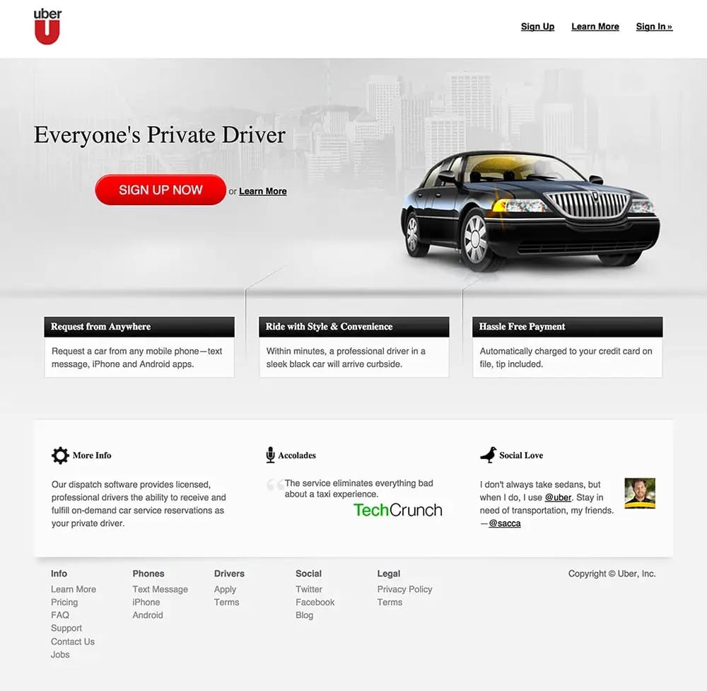
Uber’s early value proposition centered on convenience, cashless transactions, and rapid service. Their messaging highlighted several of the following key features:
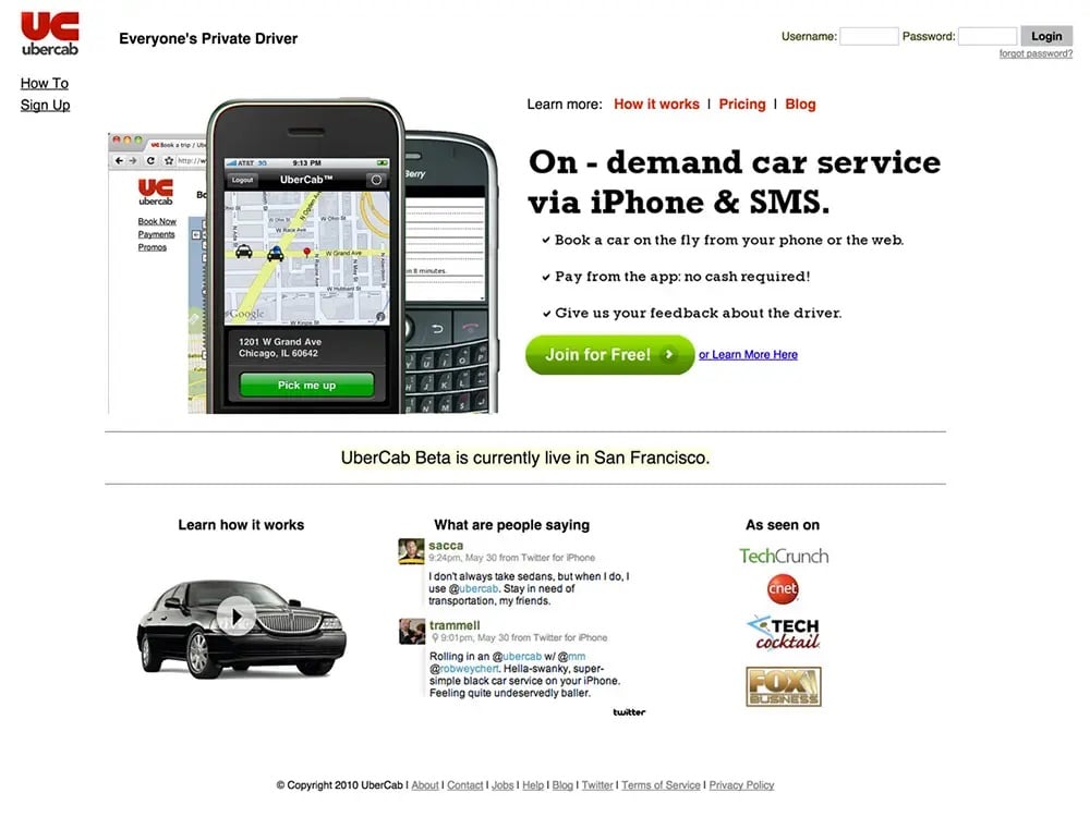
By 2013, Uber had significantly refined its user experience and brand positioning. The website from this year featured a more luxurious and sophisticated design that reflected Uber’s growth and evolving brand identity.This version of the website boasted a luxurious, moody aesthetic with a prominent “SIGN UP NOW” CTA. The following key sections of the website focused on enhancing the core Uber experience:
Uber enhanced its credibility by incorporating more social proof, featuring accolades from prominent platforms like TechCrunch and endorsements from well-known influencers, including @sacca. The website also included a comprehensive footer with legal information, driver resources, and contact details, showcasing the company’s commitment to transparency.
Uber’s platform demonstrated significant strengths, notably in its clear and concise content. The messaging was straightforward, adeptly focusing on the core benefits and effectively communicating the essence of its service. This clarity was complemented by a polished, premium design that perfectly aligned with Uber’s luxury brand image, reinforcing its positioning in the market as a high-end service provider.
However, there are areas where Uber’s website could see improvement. The visibility of the “SIGN UP NOW” button could be enhanced to better capture user attention, making it a more compelling call to action. Additionally, incorporating a more diverse range of user testimonials could broaden the service’s appeal, making it resonate with a wider array of user demographics. By addressing these aspects, Uber could further refine its user engagement and broaden its market reach.
Uber’s evolution offers several critical insights that can guide other businesses in their journey toward success. A primary lesson is the importance of prioritizing user experience; focusing on intuitive design and clear calls-to-action is essential. This approach ensures that users can navigate the platform effortlessly, which enhances their overall interaction with the service.
Another key takeaway is the need to clearly highlight unique advantages. Articulating what sets your service apart from competitors can significantly impact market presence and customer choice. Additionally, it’s vital to evolve with your market. Regularly updating your website to reflect changes in your business and the needs of your audience helps maintain relevance and responsiveness in a dynamic marketplace. By adhering to these principles, businesses can build an adaptive online presence.
Each iteration of their website demonstrated a deeper understanding of user needs and a commitment to enhancing the user experience. Their design philosophy guided visitors towards specific objectives with intuitive navigation, clear information, and persuasive calls-to-action. The focus was always on providing a seamless and enjoyable user experience.They effectively used social proof to reinforce its authority and trustworthiness. Incorporating customer reviews, case studies, and media mentions played a crucial role in building trust with potential users.Uber’s messaging focused on how their services could improve users’ lives, ensuring that the benefits were relatable and impactful, rather than just listing features.
Their transformation from a scrappy startup to a global leader in ride-hailing underscores the importance of innovative thinking, clear messaging, and user-centric design. For founders and marketers, the key takeaways include:
By adopting Uber’s strategies businesses can craft an engaging online presence that resonates with their audience and drives success, demonstrating that with the right approaches, it is possible to revolutionize an industry and establish a lasting brand.
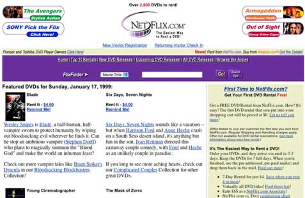
In 1999, Netflix was a fledgling startup with an ambitious dream: to transform the way we rent movies. Dominated by Blockbuster, the market saw Netflix introduce an online DVD rental service that promised no late fees and convenient home delivery, radically differentiating itself from traditional video rental stores. Netflix’s early website was straightforward: “No Late Fees, No Due Dates, Unlimited Rentals.” This clear messaging tackled the frustrations of video rental customers head-on, offering a more convenient and user-friendly solution.
The 1999 website embodied the era’s design ethos—simple and text-heavy with blue hyperlinks. It focused on this essential information:
Despite laying a solid foundation, the 1999 site had several areas ripe for enhancement. A clearer visual hierarchy could better guide users’ eyes from new releases to personalized recommendations, improving navigation and user experience. Enhancing interactivity by incorporating features such as trailers or a queue system would make browsing more engaging and dynamic. Additionally, a stronger call-to-action, crafted to be more bold and compelling, could effectively nudge users toward signing up, increasing user engagement and conversion rates.
By 2004, Netflix had significantly refined its website to better communicate its value proposition and engage users. The design became cleaner and more user-centric, emphasizing the core benefits of the service.The tagline “DVD rentals delivered to you!” succinctly captured Netflix’s essence. The message of affordability was also clear, with plans “Starting at only $11.99 a month,” targeting budget-conscious consumers. The site utilized a cozy image of a couple enjoying a movie night at home, creating an emotional connection with visitors. This imagery made it easy for users to imagine the benefits of Netflix’s service in their own lives.In addition, A prominent “Start Your FREE TRIAL” CTA was featured, inviting users to try the service without any risk. This approach effectively lowered the barrier to entry and was instrumental in attracting new subscribers.
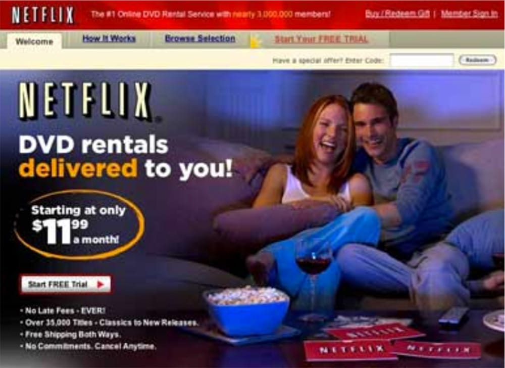
Netflix’s key benefits were strategically and clearly outlined, directly addressing the specific desires and concerns of movie enthusiasts. They addressed several significant consumer frustrations with its innovative features, drastically improving the rental experience. The elimination of late fees removed the penalties traditionally associated with rentals, relieving a common pain point for many. Additionally, with an extensive library of over 35,000 titles, Netflix catered to a diverse range of tastes, ensuring there was something for everyone. The convenience was further enhanced by offering free shipping both ways, which not only made the process easier but also more cost-effective. Moreover, the flexibility to cancel at any time without commitment reduced user anxiety about being locked into long-term agreements, making Netflix an appealing choice for those wary of commitments.
The website prominently displayed “Nearly 3,000,000 members,” leveraging this social proof as a potent tool to build credibility and trust among potential subscribers. By 2014, recognizing the shifting dynamics of digital entertainment, Netflix pivoted from its DVD rental model to focus primarily on streaming. This transition marked a significant evolution in its business strategy. The updated value proposition centered on providing instant access to a vast library of movies and TV shows, perfectly capturing the essence of convenience and accessibility with the promise: “Watch TV shows and movies anytime, anywhere.”
The 2014 iteration of Netflix’s website showcased a modern, streamlined design that prioritized user experience. By utilizing sophisticated algorithms, the platform was able to offer personalized content recommendations that were made for individual user preferences, greatly enhancing content relevancy. Additionally, the introduction of multiple profiles allowed different family members to create their own personalized viewing experiences, thereby boosting user engagement across various demographics within a household. Another significant feature was offline viewing, which enabled users to download content and enjoy their favorite shows and movies without the necessity of an internet connection, adding a layer of convenience and flexibility to their viewing habits. The “Join Free for a Month” CTA was strategically placed to attract new users, providing a risk-free trial period that encouraged users to experience the benefits of the streaming service firsthand.
Netflix’s journey offers several vital lessons for businesses looking to impact their industries significantly. One of the key takeaways is the importance of innovation to disrupt the market. Netflix has shown that striving to redefine industries and create new market opportunities can lead to substantial growth and leadership. Additionally, simplifying the design of digital platforms to enhance the visibility of content and calls-to-action is crucial for maintaining user engagement and ensuring ease of use. Another important strategy is leveraging social proof, such as user testimonials and showcasing community size, which helps build trust and validate the platform’s credibility. Lastly, the need to adapt and evolve is critical; continuously updating the platform to meet changing user needs and market trends ensures that a business remains relevant and competitive in a dynamic environment.
Netflix’s transformation from a humble DVD rental service to a global leader in streaming exemplifies its capacity for adaptation and innovation. Over the years, the company has continuously evolved its platform and refined its messaging to stay ahead of the competition and align with changing user expectations. A constant focus on user experience has been central to Netflix’s strategy. The platform’s design and functionality have been systematically enhanced to boost user satisfaction, ensuring that subscribers have a seamless and enjoyable viewing experience.
By leveraging personalized recommendations and integrating features like multiple profiles and offline viewing, Netflix has set a high benchmark for user-centric design within the entertainment industry. These features not only cater to individual preferences but also enhance the overall convenience of using the platform.
Netflix’s evolution provides profound insights into the development of a resilient and successful brand, offering strategic lessons for businesses aiming to achieve similar success, such as:
Embracing these principles can empower businesses to create compelling, user-centric platforms that withstand the test of time. Netflix’s story demonstrates that with consistent innovation, clear communication, and a dedicated focus on user experience, it is possible to transform an industry and establish a brand renowned for its excellence and reliability.
The remarkable journeys of Discord, Uber, and Netflix offer invaluable insights for brands and entrepreneurs looking to build successful ventures. These tech giants demonstrate the power of understanding and addressing the real pain points of target audiences. For instance, Discord recognized the need for reliable gamer communication, Uber transformed the inconvenience of traditional taxis, and Netflix revolutionized DVD rental and streaming services. Each solution was tailored to specific user needs, highlighting the importance of deep market understanding.
A clear and compelling value proposition is critical. Each company communicated their unique offerings succinctly: Discord as an all-in-one voice and text chat for gamers, Uber as everyone’s private driver, and Netflix allowing access to TV shows and movies anytime, anywhere. These examples show how effectively framing the benefits can resonate with the targeted demographic. Continual optimization of the user experience based on feedback is another lesson these companies underscore. Regular updates and iterative improvements based on user interactions help keep the platforms aligned with evolving expectations, ensuring they remain intuitive and user-friendly.
Visual content plays a crucial role in demonstrating the product’s features and benefits. Engaging images, videos, and infographics can convey complex information quickly and effectively, helping potential users understand practical applications and benefits in real-life scenarios. Building trust and credibility through social proof is essential. Leveraging testimonials, user reviews, and media mentions, as done by Uber and Netflix, helps reassure potential customers of the product’s value and reliability. Transparency and openness about practices and policies also contribute to building a trustworthy brand image.Creating a welcoming and inclusive atmosphere is vital in today’s global market. Using inclusive language and imagery makes products accessible and appealing to a diverse audience. Promoting community among users can also enhance engagement and loyalty, creating a sense of belonging and active participation.
As businesses grow and markets evolve, adapting messaging is crucial. Companies must continually revise their value propositions and marketing strategies to stay relevant. Discord’s shift from a gamer-centric platform to a versatile communication tool illustrates the importance of evolving messaging to meet broader needs.Innovation should aim to disrupt and redefine industries, not just improve existing solutions. For example, Netflix’s transition from DVD rentals to streaming changed media consumption globally. Thinking big and embracing change can lead to significant market impacts.
Lastly, utilizing data-driven insights for decision-making is indispensable. Analytics can reveal user behavior patterns, preferences, and trends, guiding more informed strategies that enhance the product and overall user experience.By integrating these strategies, businesses can effectively meet customer needs and build enduring brands that remain competitive and relevant in rapidly changing markets.The journeys of Discord, Uber, and Netflix highlight the importance of innovative thinking, clear messaging, user-centric design, and continuous optimization. By understanding and applying these key lessons, you can build a brand that not only meets but exceeds user expectations, stands out in a crowded market, and achieves lasting success.
©2026 Emerald Digital | All Rights Reserved